top of page

Hundreds of Pastabilities

Awarded Silver at the DINZ Best Awards        2021 in the Student Graphics section

Accepted to the International Society of Typographic Designers (ISTD)

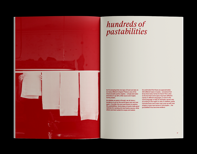
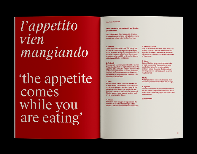
‘Hundreds of Pastabilities’ is a response to the ISTD Putting Things In Order brief that asked participants to organise, sort or classify a topic. Pasta can be categorised by shape; cut; ingredient; dish; which region it came from; the cheese; sauce; vegetable and herb combinations; which wines pair best with each type of dish; and finally; how to cook; serve; and even which order to eat it within a course! The possibilities are seemingly endless.


To visualise this vast range of information, I used Suisse Int’l for my body copy as it is a clean, legible neo-grotesque sans serif. As I progressed with the project, I introduced Suisse Works – the counterpart serif to Suisse Int’l. Set in lowercase italics, Suisse Works added sophistication and a traditional feel to the book. The text is set in a ‘Pomodoro-like’ red which references the San Marzano tomato that is prominent within Italian cuisine, especially in sughi rossi (red pasta sauces). The off-white paper stock is a subtle nod towards the sandy colour of pasta itself. I have used a range of images that are in a red and off-white duotone to be consistent with the rest of the visual system. Anyone who loves pasta can enjoy this poster and book combination as it is sophisticated, but, fun!

bottom of page